
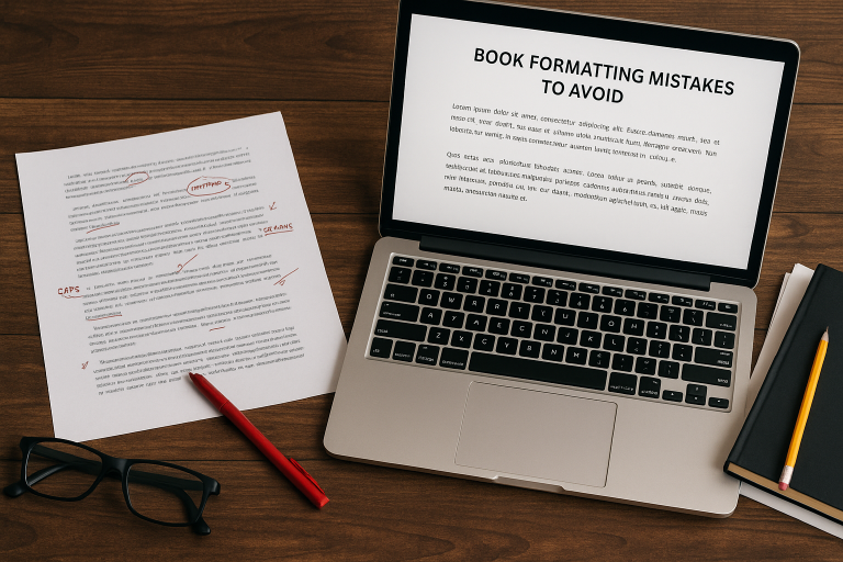
Why Formatting Matters More Than You Think
When you hear “self-publishing,” your mind might jump to cover design or marketing. But one of the most overlooked (and underestimated) steps is formatting—the process of shaping the interior layout of your book. A poorly formatted book can make even the best writing feel amateurish, while a clean, professional design enhances readability and credibility.
Formatting is your silent ambassador. Readers may not consciously notice perfect formatting—but they will notice when something’s off. Uneven spacing, odd chapter breaks, or inconsistent fonts can distract readers and even lead to bad reviews.
Table of Contents
1. Common Formatting Traps to Avoid
Whether you’re using Amazon KDP or IngramSpark, these are the most frequent formatting mistakes new authors make:
Using tabs instead of paragraph styles: This leads to inconsistent indentations and layout errors when your manuscript is converted.
Justifying text without hyphenation: This creates awkward white spaces and rivers of gaps running down the page.
Forgetting to embed fonts in PDFs: This can cause your book to display default or broken fonts on different devices or in print.
No attention to widows and orphans: These are single lines left hanging at the top or bottom of pages—they break the visual flow and look unprofessional.
2. Tools for Flawless Formatting
You don’t need to be a designer to create a professional interior. Here are some tools that help authors nail the formatting process:
Atticus – A user-friendly platform made for authors. It handles print and eBook formatting with customizable templates, chapter headers, and preview options.
Vellum (Mac only) – Highly regarded in the indie author community for its stunning output and ease of use. Ideal for fiction books with clean layouts.
Reedsy Book Editor – A free, browser-based tool with drag-and-drop features and export-ready files. Great for authors on a budget.
Adobe InDesign – A powerhouse for those with design experience, ideal for complex formatting needs (cookbooks, non-fiction, etc.).
3. Formatting for Print vs. eBook
A major formatting fail happens when authors assume that what works for print will work for digital—and vice versa. Here’s the difference:
Print: Pay attention to margin size, trim size, header alignment, and spacing consistency. What looks “centered” in Word may be off-center in print.
eBook: Keep the formatting flexible. Don’t use page numbers, fixed fonts, or manual breaks. E-readers adjust content based on user settings.
Pro tip: Always preview your book on multiple devices before approving proof copies. KDP’s Previewer and IngramSpark’s Digital Proof tools are essential for catching issues early.
4. Test Everything Before You Publish
Think your book’s ready? Think again. Before going live:
Print a physical proof—not just digital. Issues like tight gutters or uneven margins often only show up in print.
Review on multiple e-reader apps (Kindle, Apple Books, Google Play).
Ask someone else to read through a proof. A fresh set of eyes can spot what you missed.
Final Thoughts: Formatting is Craftsmanship
Don’t treat formatting as a last-minute technical chore. It’s a creative step—one that deserves the same attention as your plot, characters, and cover. When done right, formatting makes your story shine.
So before you hit “publish,” double-check your layout, test your tools, and make sure every page turns like it’s supposed to. Your readers (and your reviews) will thank you.